In this struggling economy, branding is still just as important… if not more.

26 11 2008

Businesses such as Walmart and McDonalds are thriving in these hard times because they have positioned themselves as the brand that will save you some cash. Whether or not these merchants actually save you money compared to other stores of similar product and price-range, doesn’t really matter when the consumer immediately associates the brand with value and savings.
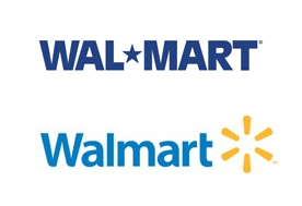
walmartDespite what some may say about branding or rebranding your company in tough economic times, Walmart recently rolled out a new, more personal, softer logo and branding campaign (they even removed the hyphen.) This new identity, with a revived use of light and color, was said to create a more accessible and experiential feel for the store. With the inclusion of this new look (and of course the horrific downturn in the economy), Walmart has seen a steady boost in sales this summer and fall when most other retailers are down close to double-digits.

So in conclusion, don’t let the image of your business suffer because you think going the cheap route on your company’s identity is a way to cut costs. Just remember no matter what you are selling, clients and consumers alike want to do business with companies that appear professional – if for no other reason then to make certain the money they are spending with YOUR company is the correct choice.


Holly Davis
hdavis@igpr.com


Love it or hate it… Helvetica is a force to be reckoned with.

16 07 2008

Designers are constantly faced with the issue of choosing the right typeface for logo design. Basically, a font should support the brand in three principal ways:

1.) enhance the overall visual appearance of the composition

2.) create a compatibility with the other design elements

3.) legibly communicate the name/message

However, these days there are just too many fonts out there to pick from and the process of finding the right fit can become quite cumbersome. So which typefaces are safe? My choice is always the clean sans-serif classic Helvetica. So here is a brief, and I mean brief, history on Helvetica:

Helvetica was created by Max Miedinger (with Eduard Hoffmann) at the Haas type foundary in Münchenstein, Switzerland in the late 1950’s. Originally called Neue Haas Grotesk, it was renamed Helvetica in 1960 from “Confoederatio Helvetica” which is the Latin name for Switzerland. The new moniker was issued to make it more internationally marketable. I think it worked.

Typography since the 1960’s has been completely saturated with the crisp clean lines of Helvetica. Today it is still one of the most commonly used fonts in the world. Look around. Street signs, billboards, storefronts, tax forms, mail boxes, subways and logos everywhere are using Helvetica because of its pure neutrality and subsequently its omnipresence in our global culture.

Of course this extreme infusion into all things type has caused a backlash or two over the last half century. Designers either love it or hate, but no one can argue that Helvetica is not a dominating presence in our world.

For all you type nerds out there that want to watch an interesting documentary on this subject, there is a wonderful movie that I had the pleasure to view a couple months ago called simply Helvetica. It is a feature-length independent film by Gary Hustwit that reveals Helvetica’s transcendent impact on society that goes beyond nation or language as the classic typeface celebrates 50 years. –hd

www.helveticafilm.com


Holly Davis
hdavis@igpr.com


KISS (No – not the American rock band easily identified by their trademark face paint and stage outfits)

20 06 2008

The KISS principle is a basic design rule that is most often forgotten in this overstimulated “make the logo bigger” day and age. KISS is an acronym for Keep It Simple Stupid. Now don’t be offended–it just simply states a concept that good design should be clean and void of unnecessary complexities. The best way to avoid this is through initial conceptualization and planning. Taking the guesswork out upfront eliminates the need–or more accurately the want–to add unnecessary details.

The ultimate goal of a good designer is to convey their message with as few elements as possible with a balance of creativity and interest. There is a tendency in advertising today to load up a layout with a lot of ostentatious features that add little or nothing to the overall power of the composition thus compromising any elegance the design once held. Planning ahead might seem like a lot of work, but in the long run it saves you time and frustration. Initial brainstorming/thumbnailing creates a blueprint for your layout. This eliminates any extras right upfront that might over complicate the concept. The objective is to stick with the beginning groundwork and avoid the extras that creep in. So just remember to Keep It Simple Stupid.


Holly Davis
hdavis@igpr.com